Ropes can be used as a prop for life drawing in order to draw attention to the geometry of the figure and individual poses. The interaction of a model with rope creates interesting internal and external structures which help to identify angles. Many painters and sculptors have used ropes or geometric structures to represent the figure in innovative ways.
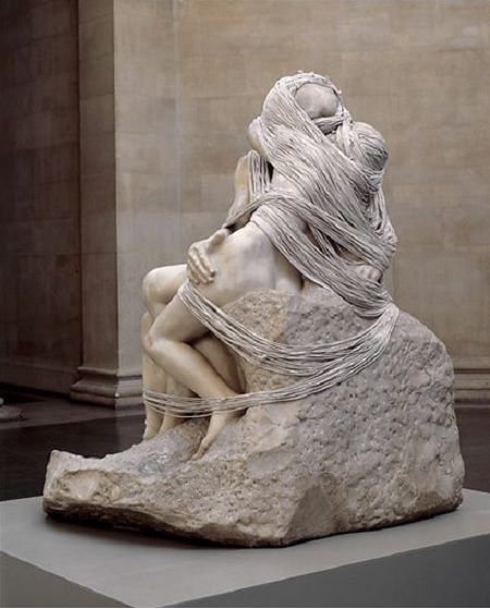
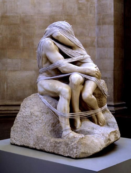
Artist Cornelia Parker wrapped Rodin’s ‘The Kiss’ in a mile long piece of rope, and retitled it ‘The Distance (a Kiss with added string)’ 2003. As with much of her work she takes something familiar and alters it to add a new layer of meaning. The rope does not function here as physical bondage but is symbolic of the constrictions of relationships. The two lovers are so wrapped up in each other that it becomes claustrophobic. It was a controversial piece, seen by some as an exploitation of Rodin’s original work, and one viewer was driven to vandalise the rope with scissors to set the lovers free. There is an interesting contrast between the hard marble of high art, and the impermanent string of low art. Whilst the original work was considered indecent in its day, Parker highlights the way in which partial concealment can increase erotic charge.
At 26 metres tall, Anthony Gormley’s complex geometric metal sculpture ‘Exposure’ is difficult to read up close, becoming an abstract frame for the landscape. However from a distance the composition of straight lines and angles morphs into an accurately proportioned three dimensional crouching man, The 2,000 components were fabricated by a pylon manufacturer in East Lothian and then shipped to the Netherlands for assembly. The sculpture itself is inspired by the economy of means and the connectivity of the pylon. Gormley began by making a cast of himself in the desired position, and then algorithms were used to design the geometric structure so what it would describe the forms of the body whilst maintaining structural integrity. The most concentrated meeting points of the lines happen at the head, throat, heart, stomach and genitals, which roughly corresponds to the “chakras”, or energy points, of ancient Hindu thought. In this way the sculpture portrays the body as an energy system as opposed to the anatomical. The transparency of the form could be carried over into life drawing by focusing on the continuous line formed by the rope and not the figure itself.
Anthony Gormley, Exposure, 2010
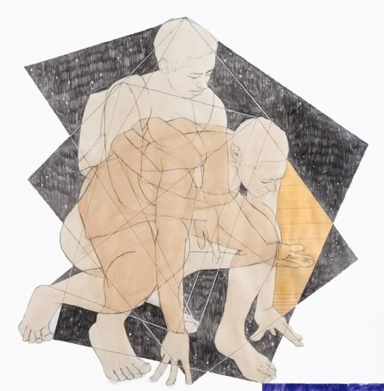
Pamela Phatsimo Sunstrum uses the subject of the figure to construct diagrams or maps, which appear to be governed by unknown geometric principles. Figures often overlap in her work to suggest compounded time, and a universal, atemporal existence. Straight lines link the extreme points of the figures like taut strings, travelling both within and beyond their forms. The encasing geometric structure gives them a monumentality. Sunstrum’s work explores the parallels between ancient cosmology and advanced theories in science, appearing simultaneously futuristic and ancient, like a constellation map.
Like Gormley, her figures are all modelled on herself, using her training as a dancer to explore existential narratives and scientific and mathematical theories. “I’m curious about how arms can hang, how knees can bend, how a back can twist to suggest an entire identity or history even if it’s an invented one.”
Pamela Phatsimo Sunstrum, Panthea 01, 2016


