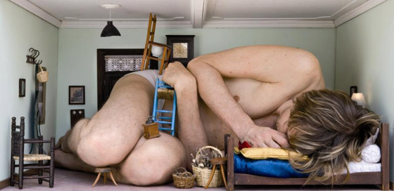
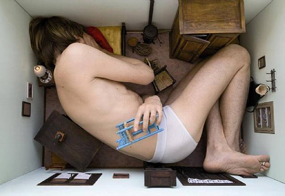
Scale is always relative in a drawing – we rarely draw ‘to scale’. When reading an image, we rely on objects of known size to tell us how close we are. As we know, the further away something is, the smaller we should draw it, due to the laws of perspective. However these conventions can be manipulated in art, to fool the eye and create surreal compositions.
One artist who has played with this idea is Jean-Francois Fourtou in his 2007 series of sculpture and photographs ‘Mes Maisons’. We tend to judge the size of an object by the its relationship to the proportions of the body. As we grow, objects which appeared large to us as children may seem to have shrunk. Fourtou’s series is based on this sensation of the changing scale of his childhood bedroom. By creating a composition of everyday objects in miniature, he gives the impression that the figure is a giant, in an Alice in Wonderland scenario. Our eye is unable to determine whether it is the figure or the objects which are altered in size.
Miniature objects have the ability to draw us in or make us feel clumsy, whereas enlarged objects can overwhelm us and make us feel small. Marc Quinn makes sculptures of natural objects blown up to huge proportions, including five stainless steel shells. He used a 3d printer to create models of real shells before casting them. Model Natalie white posed nude within these sculptures, and the effect is a beautiful yet alarming sense of the vulnerability of the human body against nature.
Marc Quinn, ‘The Archaeology of Art’, 2011
Whilst these artists created elaborate sculptural pieces in order to alter our perception of scale, it is possible to achieve the same effect by much simpler means- a camera phone! Anyone who has visited the leaning tower of Pisa will be aware of the technique by which the image is flattened and objects in the foreground and background merge. By placing small objects closer to the lens, we can make them appear much larger in relation to the objects in the background, beautifully demonstrated by Kat to create the illusion of a flower-tutu.
Kat, 2017
These principles can be translated into life drawing – using careful placement of objects in relation to the figure, we can grow or shrink our model as desired!


